

How do births and housing prices actually impact enrollment in Bellevue School District?
Births in King County not correlated with enrollment since 2007; housing prices more complicated, but overall correlate with higher enrollment; also: K-3 private enrollment gains are 85% of BSD loss

Bellevue School District has told us that there are three factors driving their forecasted decline in enrollment:
Declining birth rates
Rising housing prices
Pandemic-related job movements
These are from the district’s presentation.
The first and second topics have plenty of data we can explore. So I explored them. A possible correlation between housing prices and K-3 enrollment also spurred me to take a look at K-3 enrollment changes in private schools.
Executive Summary
Births in King County have a positive correlation with BSD kindergarten enrollment for births recorded from 2000-2019, but not at all since 2007, no matter if we include or exclude pandemic years. The same trend hold for first grade.
The likely reason for this is that migration in and out of Bellevue and its school district are a far larger factor than births. 88.6% of growth in Bellevue from 2000 to 2019 has been from foreign born residents.
Prior to the pandemic, rising housing prices are correlated with increasing overall enrollment. Rising prices correlate with decreasing enrollment only when we zoom into K-3 students and include pandemic years.
Previous analysis showed large growth in private schools within Bellevue School District boundaries during the pandemic. A more narrow analysis on K-3 students shows disproportionate private school K-3 growth, equal to 85% of the district’s K-3 decline.
For more on Bellevue School District’s forecasts and elementary school consolidation efforts see my previous posts:
On births
Data and trends
I explored the relationship between births and enrollment using state data on births in King County and state data on kindergarten enrollments in Bellevue School District.
First up, let’s look at a scatter plot for births from years 2000 to 2014 and how those births varied with the kindergarten enrollments five years later:
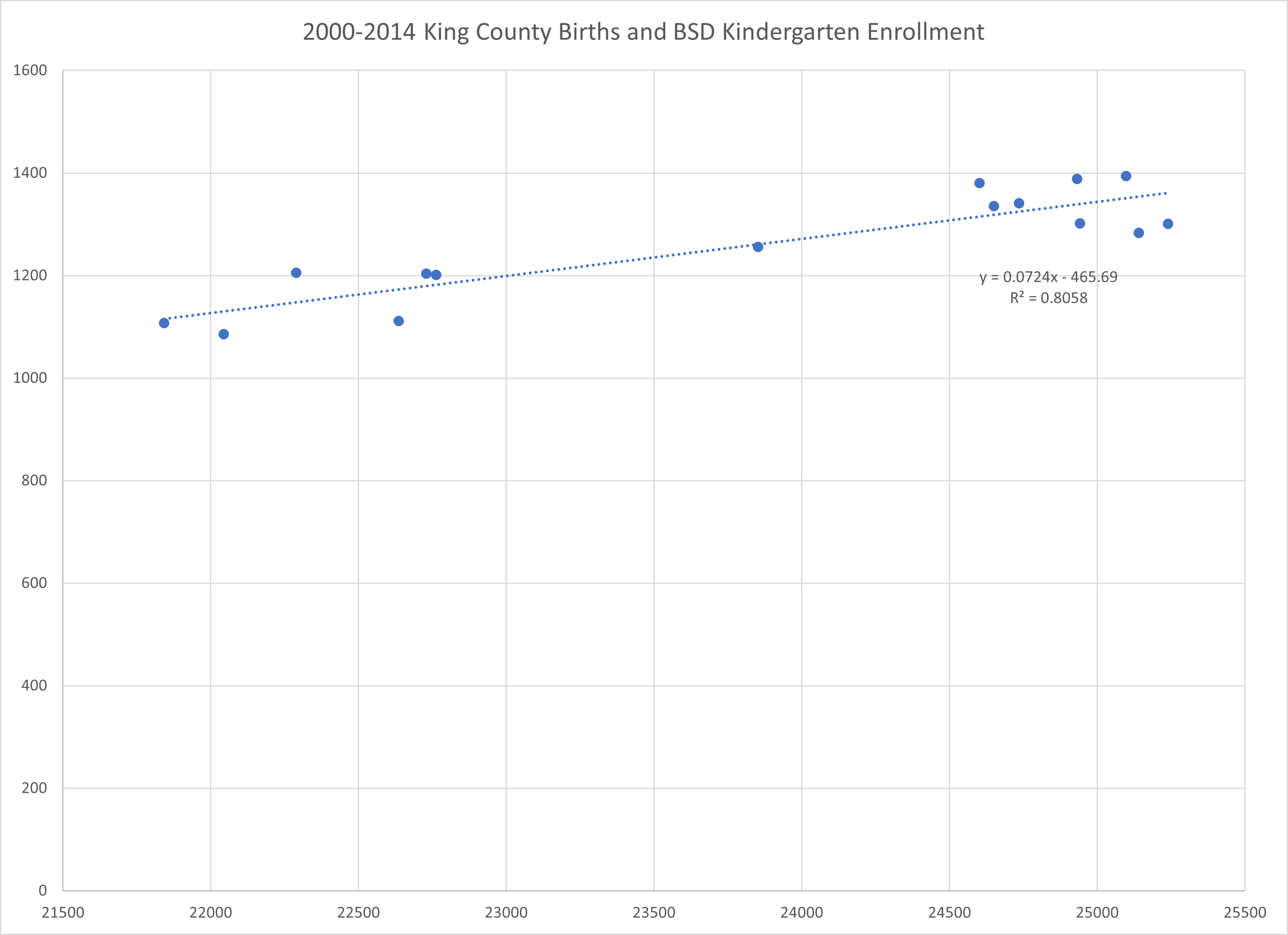
There does appear to be a bit of a trend there, and the r-squared value of 0.8058 reflects a fairly tight fit of the trendline. The slope of the trendline shows that for every 100 births in King County, we’ll have an extra 7 kindergarteners five years later.
However, this almost looks like a bimodal distribution. There’s a cluster on the left side, a cluster on the right side, and one data point in the middle. Maybe there’s a time relationship? Let’s draw a line from point to point, connecting each point with its neighboring years:

Yep. We’re progressing from one period of fewer births and lesser enrollment to another of higher births and higher enrollment. Looking at the data I can see that that odd man out between the two clusters is from year 2006. What if we look at birth years 2007 to 2014?
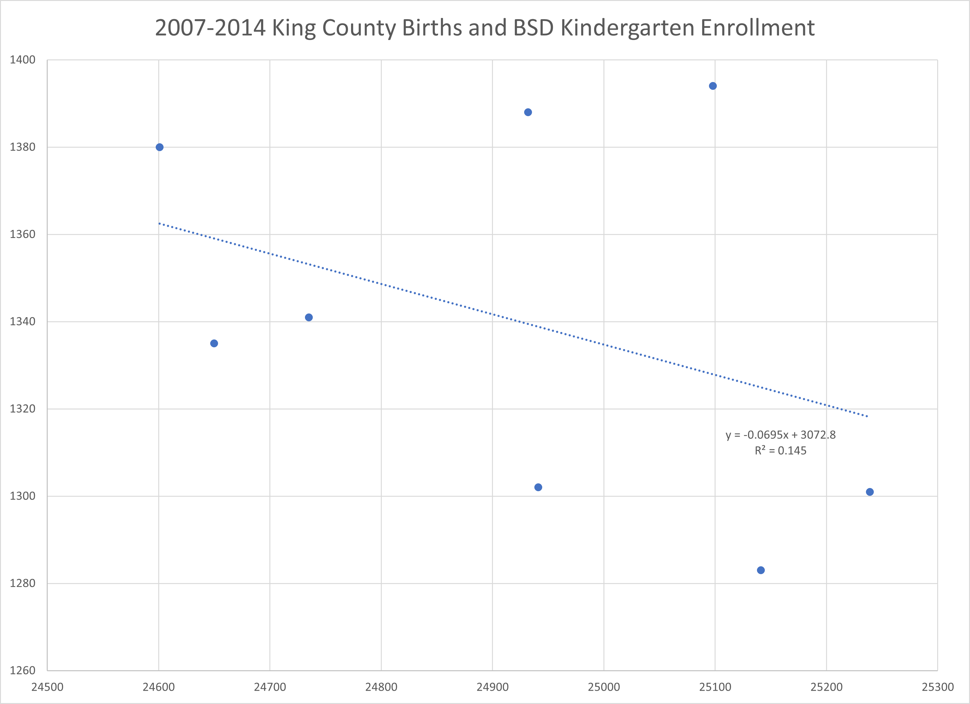
Not only does the R-squared value of 0.145 indicate a basically no correlation, but the slope of the trendline is negative. That would be very weird, if true. It’s more likely that there’s no relationship and lower enrollment correlated with higher births by random chance.
I also repeated this analysis for first graders since the BSD enrollment data shows that first grade classes will reliably add anywhere from 50 to 150 kids as students progress from kindergarten to first grade. It looks the same for first graders:


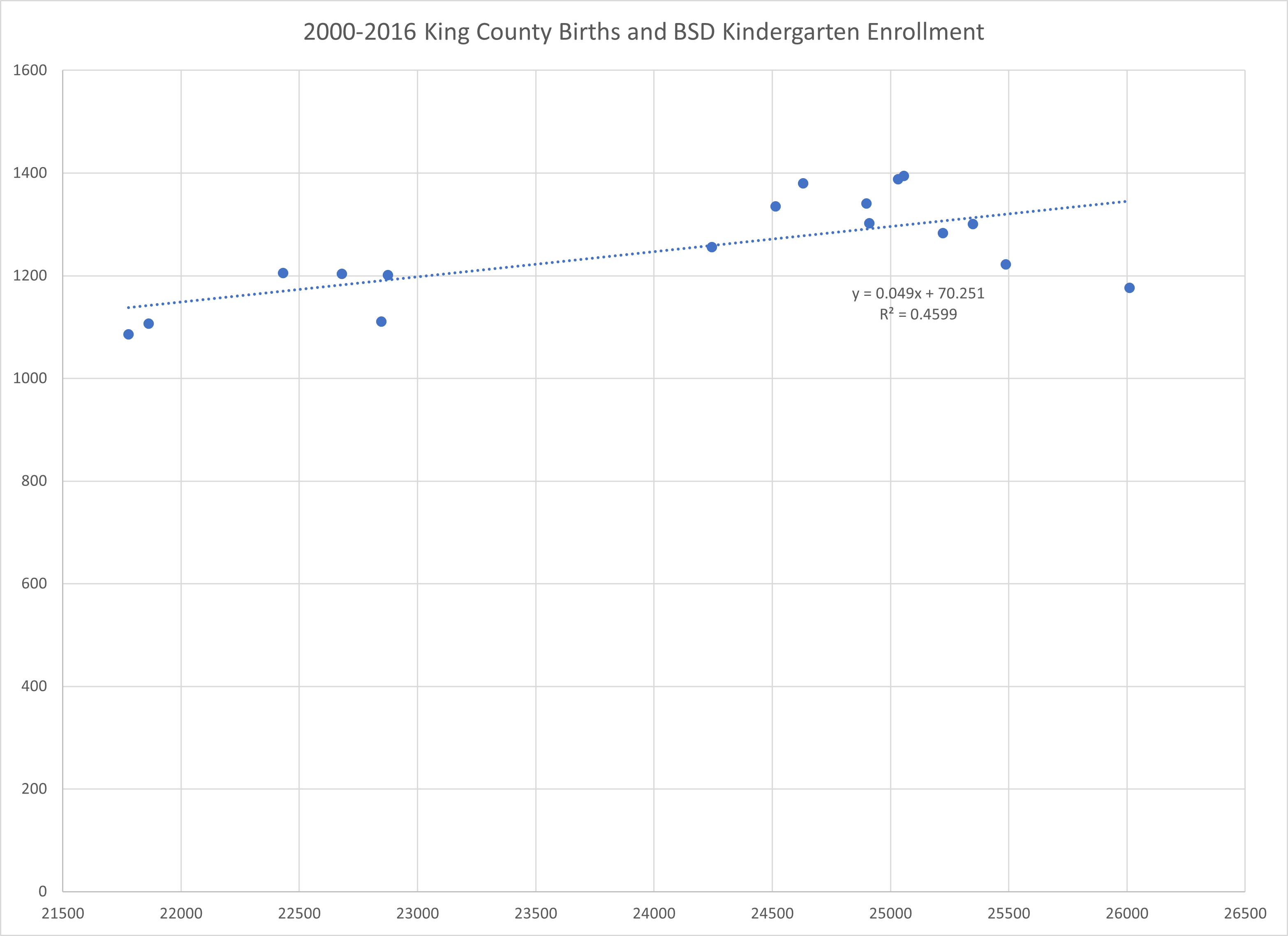
Lastly, I was deliberately omitting pandemic years to try to make the best case possible for birth impacts. The pandemic years have a dramatic enrollment drop and those cohorts were born in the largest birth year cohorts in our data. If I include pandemic years then the trend since 2000 falls to an R-squared of 0.4599:
Notes on data:
Births were taken from the Washington State Births Dashboard and from the 1999, 2000, 2001, and 2002 Washington State Vital Statistics Reports. The births dashboard uses the same figures as the reports, it just didn’t show years prior to 2003.
Births were adjusted to reflect that children born in September or later will join a later year cohort. The adjusted year has 75% of births in its own year and 25% of births from the year prior. For example, the kindergarten class of 2012 is matched with 75% of births from 2007 and 25% of births from 2006.
Enrollment figures are from the OSPI’s Data Portal.
How is it possible for births to not reflect enrollment?
There are two ways we can create kindergarteners that attend Bellevue School District.
The stork pays a visit to parents already living within the district boundaries, and they continue to live there for the next five to six years.
The stork visits parents living outside the district boundaries, and they move to Bellevue some time within the next five to six years.
Also, in both scenarios, parents must not opt for private or home schooling.
Starting in the 2012-2013 school years that second method appears to have made the first irrelevant. Remember how our long-term trend showed that 100 births in King County was correlated with 7 kindergarteners five years later? This becomes completely disconnected. Here’s a table that shows the change in King County births, adjusted for school year, and the size of the Bellevue kindergarten and first grade cohorts:
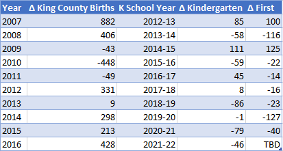
Births go up, cohort goes up. Births go up, cohort goes down. Births go down, cohort goes up. And so on and so on. The signal from births is lost in the noise of migration.
You can see this in the King County and Bellevue population data as well. Bellevue’s population growth diverges from the county’s at about the same time that King County births become disconnected from BSD enrollment. I used population estimates from the state Office of Financial Management to chart this:

Note that this chart is dual axis to better visualize the trend. The population of Bellevue is not greater than the population of King County.
In light of the City of Bellevue’s own 2021-2022 Community Profile this is entirely unsurprising. This report states that only 27% of Bellevue residents were born in Washington state, and that the overwhelming majority of our growth has come from foreign-born residents:
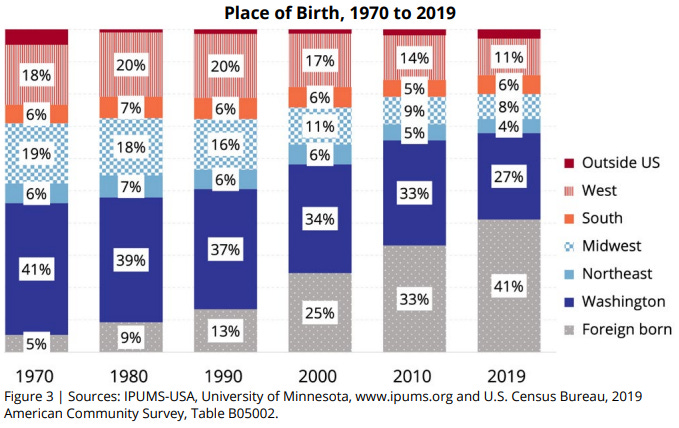

Add those last decades together and you’ll find that 88.6% of the growth from 2000-2019 has been from people born outside of the United States.
To expect that King County births will have a large impact on school enrollment is to expect that our migration trends will cease.
Last point on births: the chart of births that the district is using, intentionally or not, presents a distorted picture of how births in King County are changing over time. Here’s their chart:
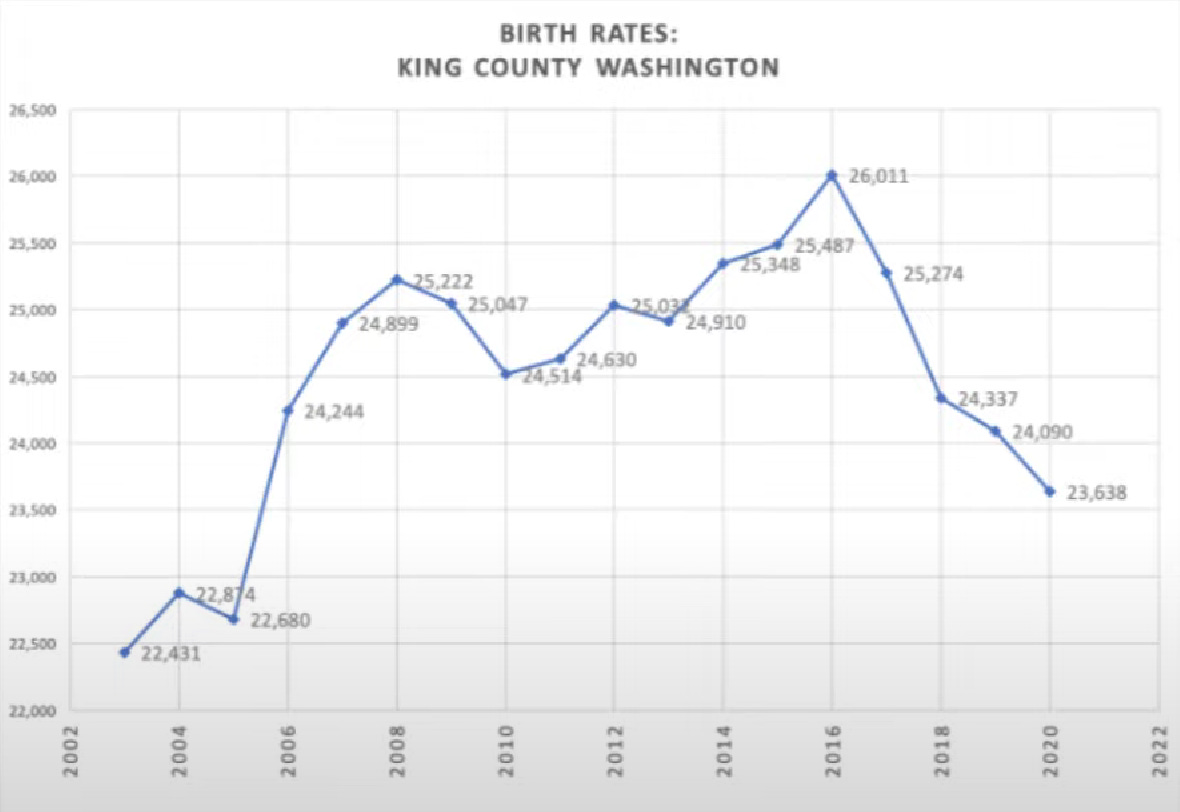
The Y-axis starts at 22,000, which makes the variation in number of births look like far more dramatic than they actually are. If you’re not looking closely you might think that births have fallen by half since 2016.
Here’s the same data, along with a few more years of history, plotted with a Y-axis that starts at zero:

Yes, 2021 recorded the lowest number of births since 2005. But that’s nowhere close to a 50% drop. You can also see that that there’s a few up and down cycles preceding the final down year.
On housing prices
The district promotes a theory that goes something like this:
Housing is becoming too expensive for families with young children. Therefore they are either moving away or choosing not to move to Bellevue.
That sounds plausible enough. But there’s an alternative theory:
High-quality schools attract parents and would-be parents to move to Bellevue. This increase in housing demand causes the price of housing to rise.
If housing prices go up and enrollment goes down, then the district’s theory is likely true. If housing prices and enrollment go up together, then the alternative is the more likely model of reality.
We can test this. We have the data.
I looked for sources for historical housing data and found that the Zillow Home Value Index goes all the way back to 2000 and allows me to zoom in to Bellevue itself instead of using some larger geographic boundary like county or MSA. Zillow has this to say about the index:
A smoothed, seasonally adjusted measure of the typical home value and market changes across a given region and housing type. It reflects the typical value for homes in the 35th to 65th percentile range.
I can anticipate objections that we need to look at specific types of housing, but I think this analysis would have mostly the same results no matter how you slice the housing market. There’s no segment of the market that has had its prices move down while the rest of the market moves up, or vice versa.
I used the same enrollment data as above in the exploration of births and enrollment.
Let’s dig in, starting with numbers that exclude pandemic years:

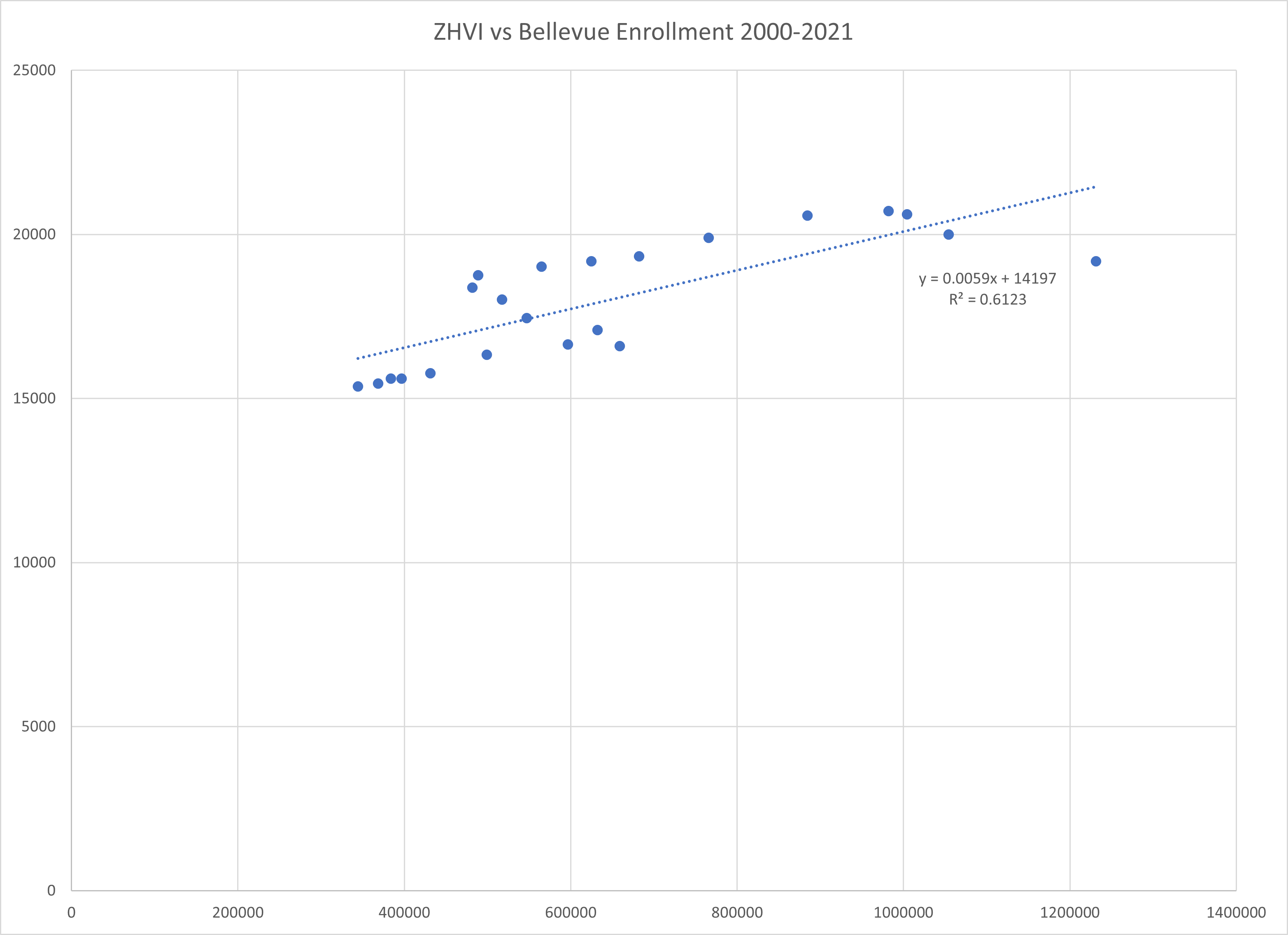
That sure looks like a positive correlation to me, with a trendline that fits fairly tightly. Each additional thousand dollars on the index correlates with roughly eight more students.
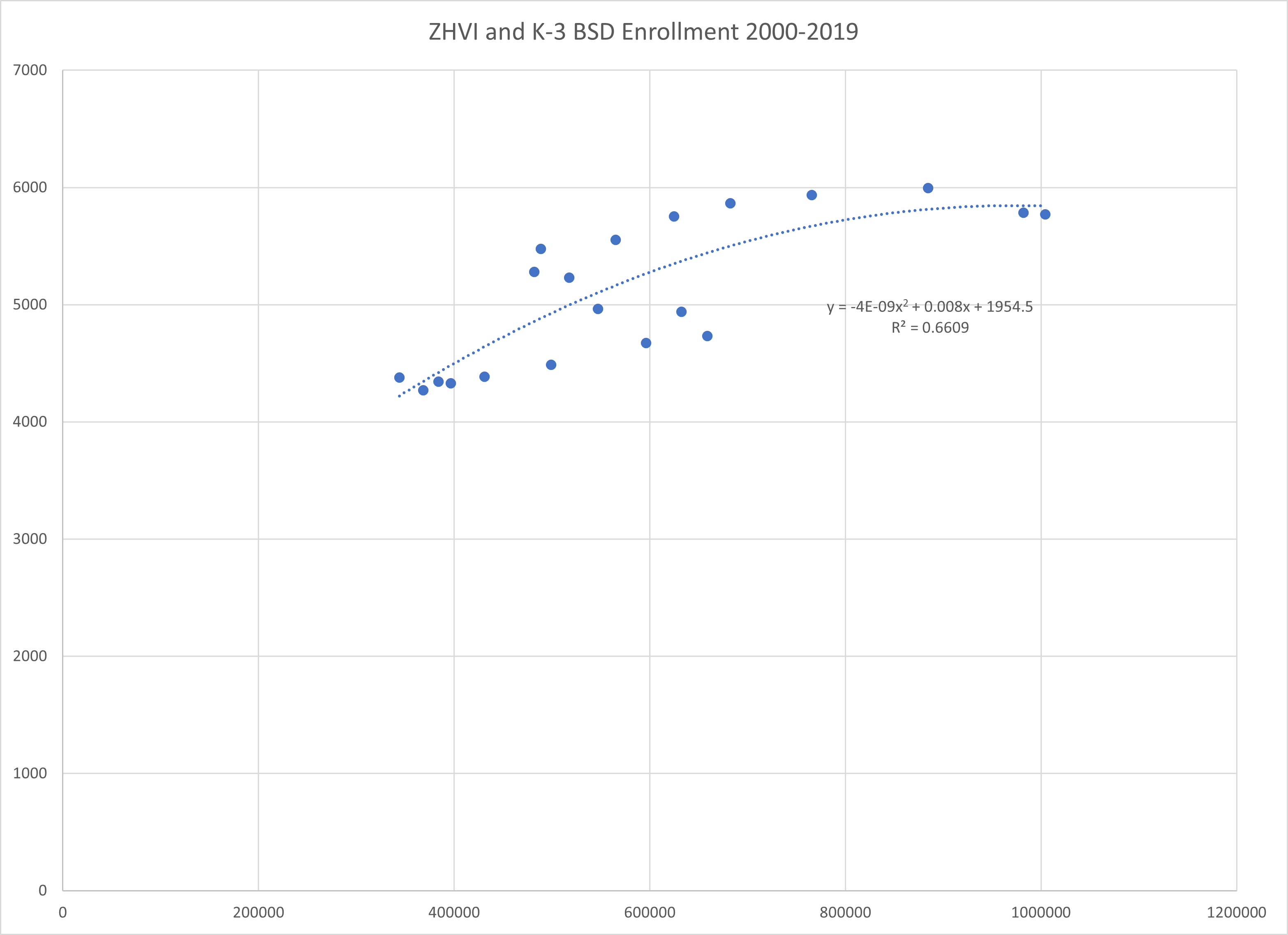
To be more fair to the district’s theory, they’ve specifically talked about families with young children, not families with children in general. Let’s look at ZHVI and K-3 enrollment:
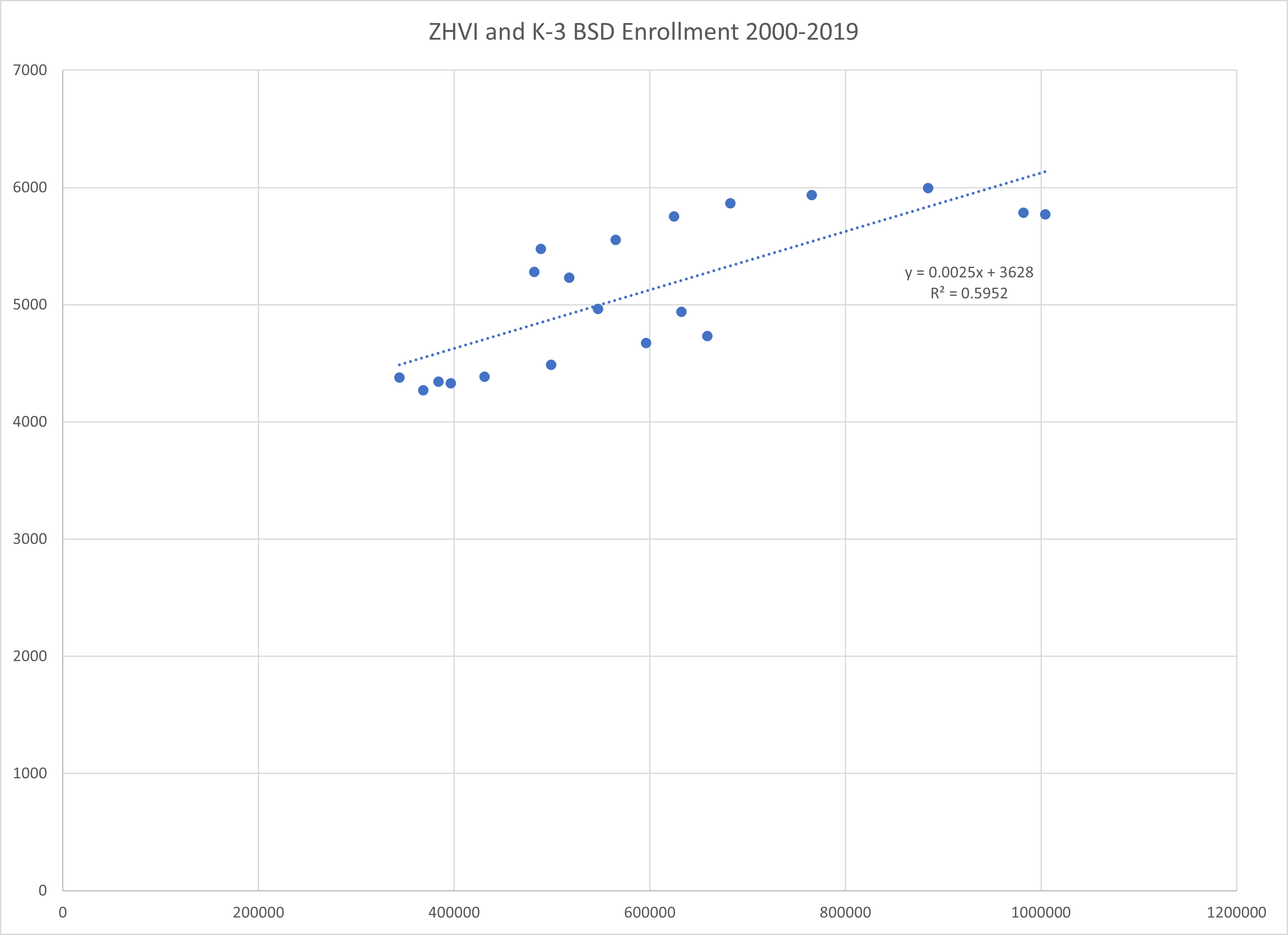
Still a positive correlation, though less tightly fitting. Those two data points on the right are lower than peak, but are still higher four of the 19 years we’re looking at.
I’ve excluded the pandemic years from the above two graphs. My prior look at private school enrollment and home schooling leads me to believe that these two factors are the dominant component of the enrollment decline. Housing prices did happen to be rising at this time as well. All that said, here’s what this looks like with the pandemic data, first for overall enrollment:
With K-3, including the pandemic, there’s a slightly positive linear relationship, but it’s not a tight fit:

A polynomial curve is a better fit:

If this reflects the actual relationship between housing prices and enrollments, then perhaps we should move forward on consolidating schools. However, this trendline goes parabolic as a result of just two data points recorded during a very strange time in history. If we take those data points away we get a curve that appears asymptotic:
And if we go for a higher order polynomial, the curve reflects the deceleration we see in losing fewer kids from the last million dollars of increase than the second last million:

I can’t say with muchconfidence which, if any, of these curves represents reality. We need more data. Perhaps we just happened to crest a critical point in home prices just before the start of the pandemic.
But it’s also possible that there were effects particular to the pandemic that dominated the effect of home prices. What happened to the K-3 cohorts in private schools during this period?
A little more private school analysis
In my previous post on cohort progression I found that the enrollment drops were disproportionately concentrated in elementary grades, and the K-3 numbers above show the same thing.
I hadn’t yet looked at private school growth for K-3, but I couldn’t post this without giving it a shot. I used the same method as in my first post, compensating for bad state data by using federal data to get enrollment sums for 2019-20, then using the state data that was not muddled with impossible numbers to calculate a growth rate from 2019-20 to 2021-22, and applying this growth rate to the federal 2019-20 sum.
Doing this calculation shows that early grades grew disproportionately faster in private schools than overall enrollment. While overall private school growth within Bellevue School District was 15%, K-3 growth was 26.5%. I estimate that private schools added about 645 K-3 students over these two years.
K-3 enrollment in Bellevue fell from 5,784 for 2019-20 to 5,027 for 2021-22. That’s a loss of 757 students.
For every drop of 100 K-3 students in Bellevue School District, private schools within the district gained 85.
Unfortunately the home school data we have for these grades is incomplete. Parents aren’t required to register as homeschoolers until their children are eight years old. The state’s public data doesn’t include grade breakdowns, either.
I’ll qualify again that my private school enrollment numbers are an estimate that’s necessary due to the broken data provided by the state. If someone has the actual numbers, or a better estimate, I’m all ears. The district has told me they have a much lower figure for kids that left for private schools and that they’ll provide me with those numbers, but I haven’t been able to see them yet.
There are 37 private schools in Bellevue, I may just end up contacting them directly.
Conclusion
I’ll keep this short.
We haven’t been able to see King County births reflected in Bellevue School District enrollment data for more than a decade. Migration trends dominate birth trends.
Housing prices might have impacted K-3 enrollment during the pandemic, but this is greatly reduced when we take private schools enrollment into account.
So why does the district think these factors are driving the enrollment decline?
Did they even try to disprove their hypothesis?
Why am I doing this instead of the board?
Hey Brandon, I found the same exact things approaching the problem from a number of different angles then you did.
Here's what I found: https://www.dropbox.com/s/wogmfycyw0onlpf/Bellevue_School_Board_Letter_Feb_3_2023_p.pdf?dl=0
Or google drive link if dropbox doesn't work: https://drive.google.com/file/d/1HNHIJXSnyQ7FayXi-xlp08nw_bsu8hAw/view?usp=sharing
> Did they even try to disprove their hypothesis?
> Why am I doing this instead of the board?
Why are WE doing this, as it turns out. I spent days gathering the data and sources for my letter. But the reason why is simple - Closing schools allows more BSD employees to keep their jobs and not have to fend off potential pay cuts, and solves "the problem" at least in the next year or two. A more realistic approach would look at cutting spending back while the state legislature wakes up to the problem and raises the local levy cap.
Thanks for the analysis! This makes a lot of sense. Enrollment is driven by many factors and house prices is just one signal that sums it all up. In reality, house prices going up (even if it is in this whole region or nationally) means that the economy is good. If the economy is good in all of the US, the economy (job market) is likely extremely good in Bellevue. This is because Bellevue/Silicon Valley etc are the source of growth for our economy. They will always be for the foreseable future. The tech sector attracts well educated people. Well educated parents tend to have kids that have high test scores. That pushes up the quality of the schools. People move here for the schools and non-tech parents want to send their kids here too. It's a virtuous cycle. This type of thing happens globally. When the economy is bad or something like covid hits, the effect reverses. But unless the US is going to shrink indefinitely, which I think is very unlikely, we will very soon get back on the growth trend.
The demographer from Colorado got too caught up with affordability. Affordability doesn't really matter if you just sold your small apartment in Beijing for a few million dollars or your tech co just went IPO and you're flush with cash. Only a very tiny percentage of rich Chinese people (globally) need to move here for house prices to skyrocket. A big motivation for Asian immigration to the US is to send their kids to school. I went to a high school where parents from Asia parachuted kids into our town. Bellevue enrollment forecast is so much more complicated and a lot of global factors need to be considered. If one is in Iowa, maybe it's as simple as birth rates and affordability driving migration, but not here.
All this is pretty obvious to people who already live here because you can see your neighboring houses being bought up by immigrants - all cash in many cases too! It's not so obvious to someone from Colorado.
Thanks for putting all this down on paper.